WRAP’N’ROLL — Food & Beverages
Brand Revamp & Relaunch . Printed Collaterals . Packaging . Menu Design . Environmental Branding
What made this project interesting was moving from dynamic to static without losing the fun. Wrap’N’Roll started out as a food truck, and with the great success it amassed, the brand set out to open its standalone branches.
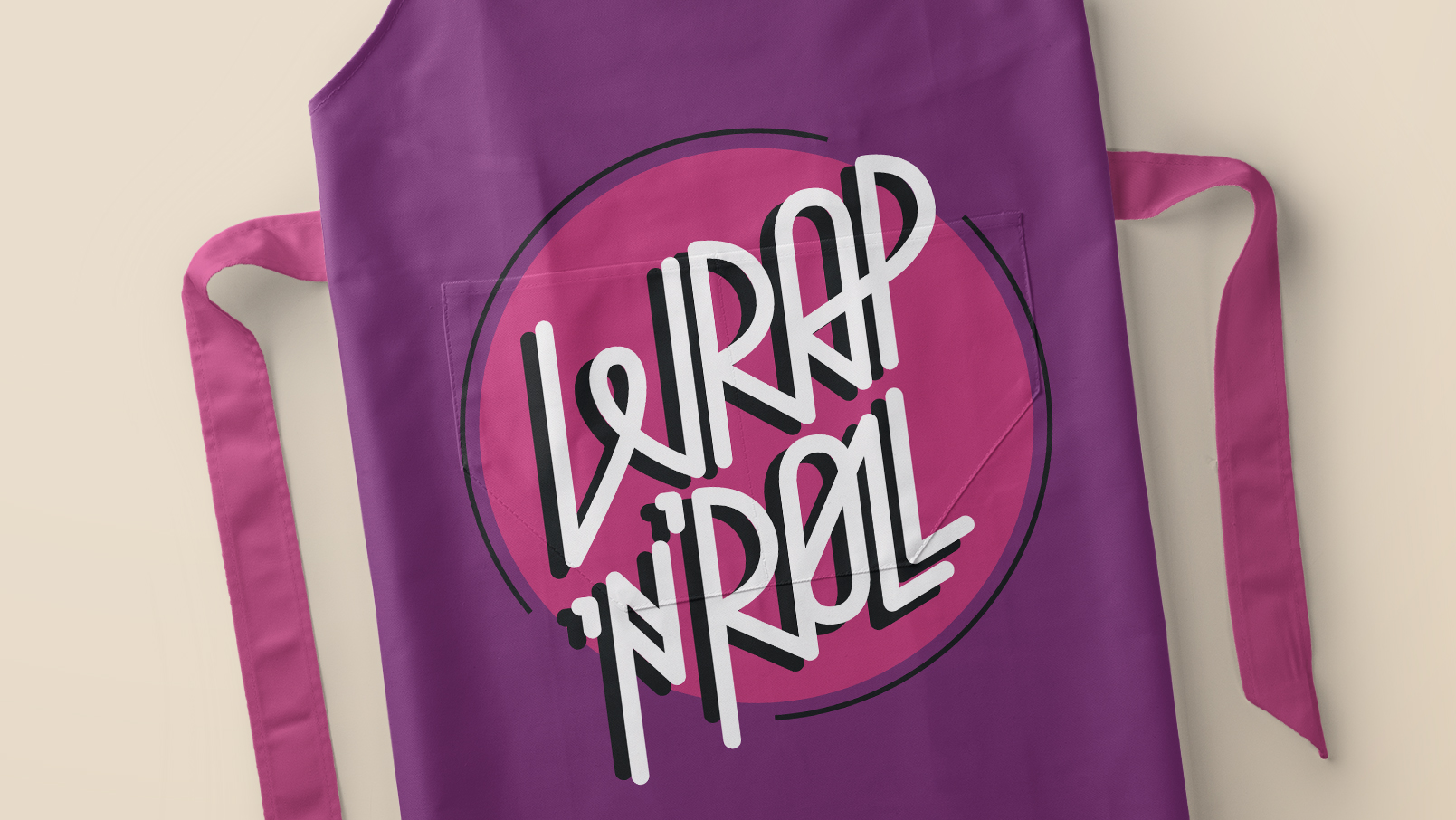
As a first step, we removed the details from the previous logo that implied mobility to revamp the brand. The change of audience had to be taken into consideration as well.
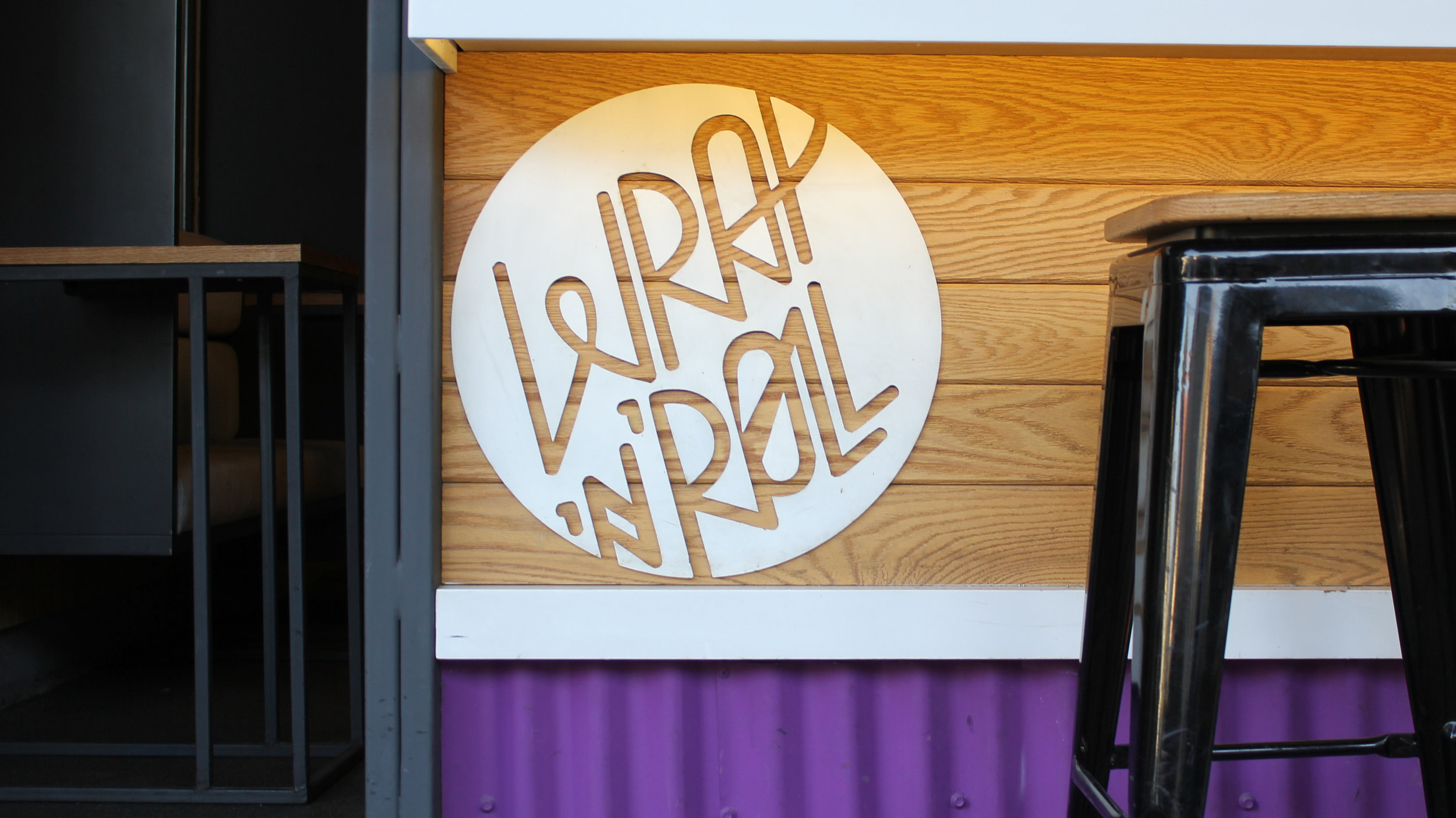
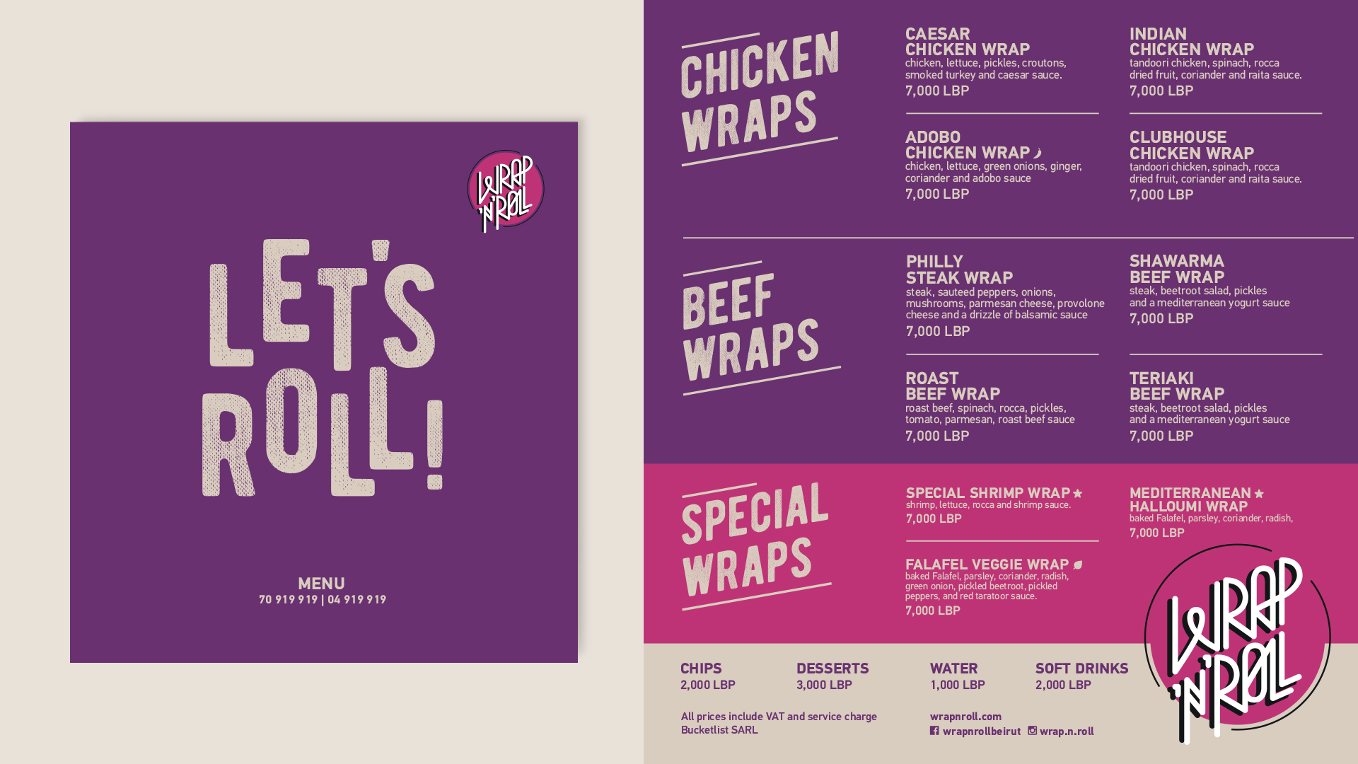
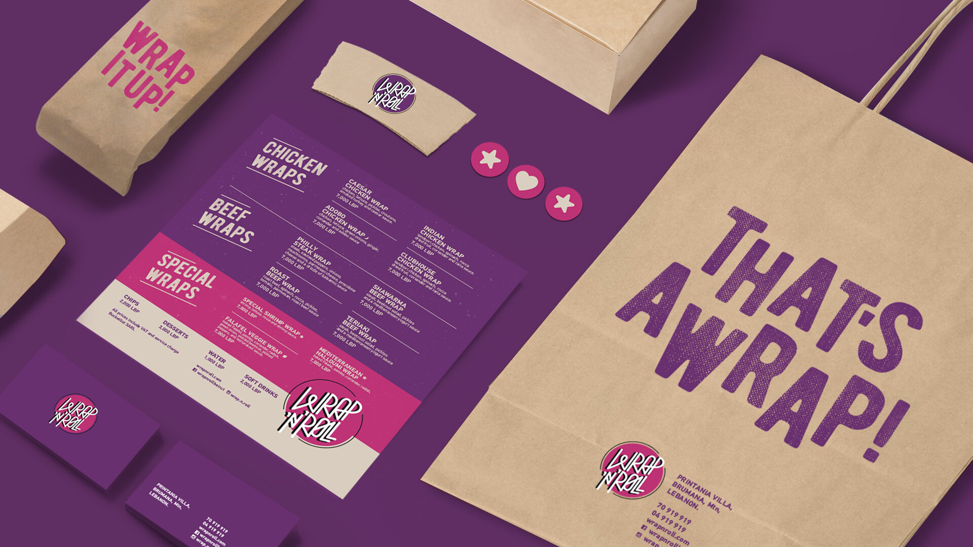
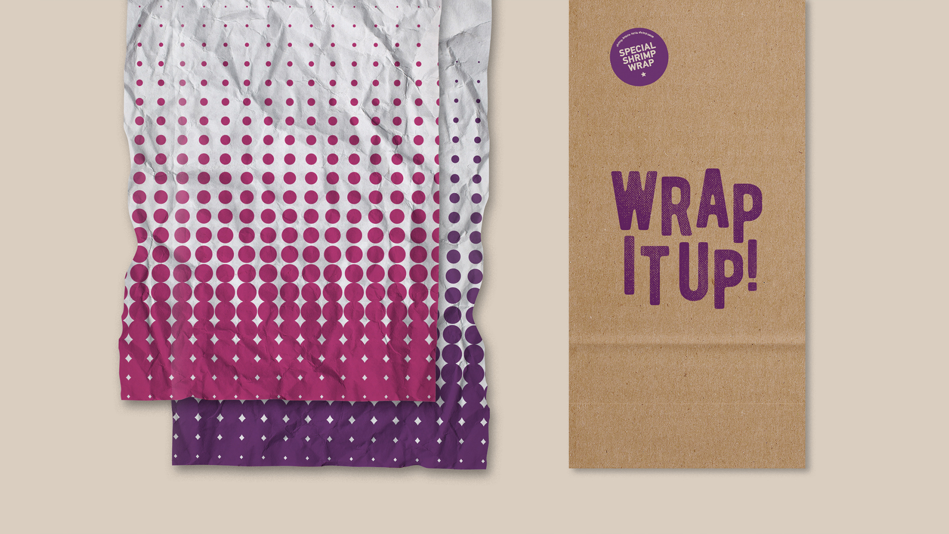
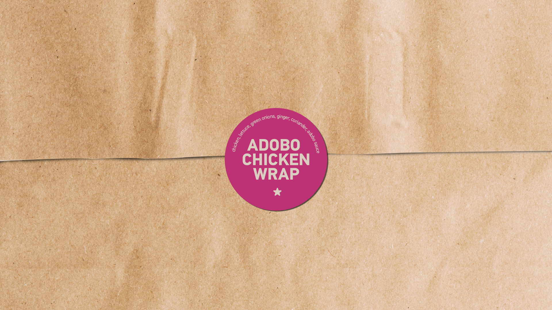
In this light, and to appeal to a wider crowd, we limited the color palette to three shades used across the deliverables. The amusing aspect of the copy came in the form of puns, related to the brand’s name, that we covered the menu, packaging and in-store branding with.


